Rapid prototyping with Livestax
Building a prototype with Livestax starts with understanding the problem that needs solved. In this short post we’re outlining how we built one of our earliest prototypes for a large public sector organisation.
We were lucky enough to have the client onboard and working in conjunction at every step of the way, and Livestax proved to be a platform that easily supported this kind of rapid and agile prototyping.
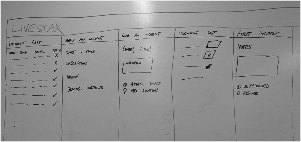
Before we could start building anything we had to understand the problem; after being briefed on the challenge, we sat down with the client to better understand their requirements and to hand draw some concepts with them.
The structure of Livestax relies on isolated apps working together, the design principles are to not add too much functionality in each app, instead making simple, reusable apps that do a single job really well. This made it easy for someone completely new to the platform, like our client who had no experience of Livestax before, to visualise apps and flows without issue.
We did some initial designs on the whiteboard, outlining the high level concepts.

With some rough sketches in hand and a better understanding of the user needs we got back to the office to start prototyping in code. With Livestax you have the freedom to use whatever technology you want as apps are hosted on an outside system. For these prototypes we used vanilla HTML, CSS and JavaScript, and our apps were hosted as static github.io pages. This helped to make deployment quick and easy and was a breeze to setup.

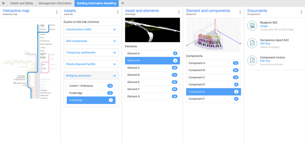
Building the prototypes was very quick, our plan was to do a first pass at two pages, holding about 4 or 5 apps each. If time allowed, we’d push on for a 3rd page. Once the first pass had been complete we’d iterate over each app to improve them, and make any changes requested from the client in the process.

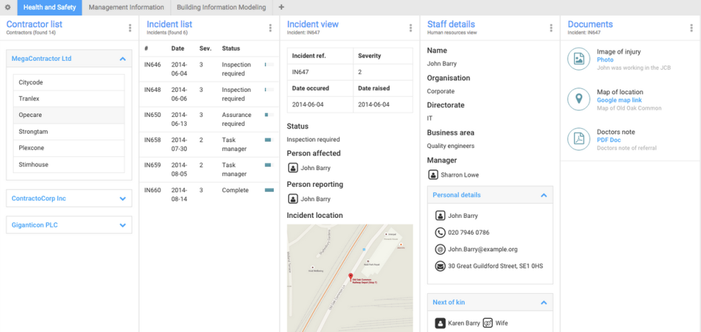
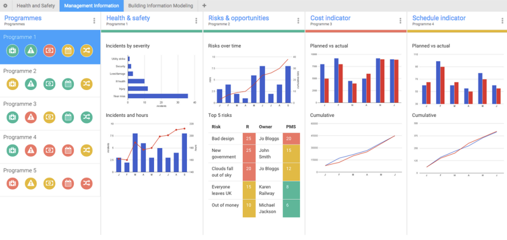
We finished the first page containing four 4 apps by the end of the day, and the client was able to access it online and make comments straight away. This was made possible in no small part thanks to the Livestax theme, which made dropping in elements and styling them a breeze. This allowed more time to focus on the user journey and app layout, and less time worrying about balance of colour and building components.
By the end of the second day we had finished another page which showed the company’s financial analytics, and had made improvements to the first page, which contained incident reports. At the end of the third day we had three finished pages, containing over a dozen apps.

The feedback we received from the client was really insightful, spurred on by the rapidly changing prototype that they always had access to, making them a part of the process. When they gave feedback they saw the implementations straight away, this was a vital component to the success of the project, where the prototypes grew close to becoming a full scale product.
The last two days were used to put some finishing touches to the pages and to add some dynamic content, at this stage it was really easy for the client to see how the apps communicated with one another, how certain apps would be suited to a global/generic role, and ultimately how Livestax could work for them going forward.
